Get to know top consultancies, and stay up to date on current career events and job offers.
Back to overview

PowerPoint for Consultants – Skills Needed as a Management Consultant

Consulting is a profession rooted in story-telling – and for that purpose, there is no stronger bond than that of a Consultant with PowerPoint. It goes beyond calling it our “bread and butter”. It is the currency of communication in the profession. It is the water we consultants swim in.

In this article, we will talk about the PowerPoint and Presentation skills that will help you survive in consulting. If you apply them well enough – you can excel too. You do not need to be an expert in all these skills from day 1 – no one expects you to be a slide ninja from the start. However, you must make it a point to learn voraciously and pick up things very quickly. The best consulting firms also have in-house training modules for all these skills, and you can also rely on your more experienced teammates for resolving your queries.

Expert Article by Agrim
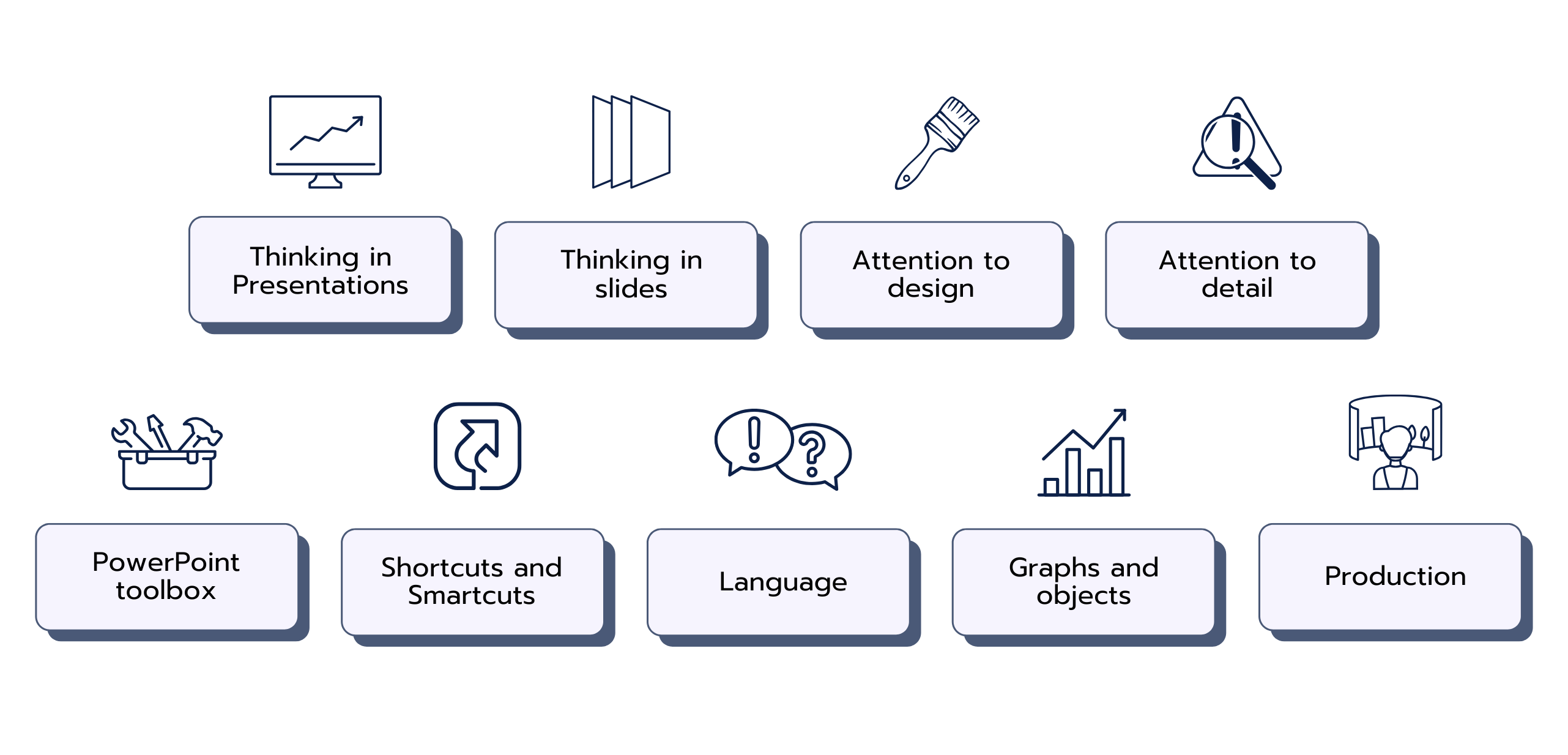
Thinking in Presentations

To make a good presentation – you must first be able to think about the presentation as a whole unit. You must be able to create a compelling and effective storyline. Much of the battle is won right there.
Less successful consultants get overwhelmed by the nitty-gritty and revisions in decks. They often do not keep the big-picture and the overall storyline in mind.

The best consultants take the following approach:

  • Create a storyline in the form of 5-20 bullets. The storyline can be created from common sense and does not need to be very specific. Each bullet is potentially the title for a slide. The full set of bullets as a single paragraph provides a complete story from start to finish – with opening, hypothesis, burning platform, analysis, outcomes, options, comparisons, benchmarks, recommendations, next steps, and so on.
  • Align the storyline with the Manager and Partner and incorporate their inputs. Since this is over email and in the form of bullets – it is a far more painless process than responding to a midnight #plsfix email from the Partner.
  • Create a skeleton deck – a presentation with empty slides and your storyline bullets as the titles.
  • Add stickers/notes on each slide to describe in more detail what kind of information, text, or analysis should appear on the slide.
  • Depending on the modules of your team members, assign corresponding slides to them and then circulate the skeleton in your team.

This way, you can remove a lot of noise and reduce a lot of iterations – because you front-loaded the alignment exercise. Keep in mind that managers and Partners are often more bothered about the overall messaging across the deck rather than on each slide separately.

Thinking in Slides

Once you have the storyline and skeleton deck in place, it’s time to start developing the slides. This requires a skill that I call “thinking in slides”. This skill is not talked about often and is quite underrated. Sometimes, it shows as a talent, while for most people it is a skill that needs to be developed with practice over time.

To think in slides, you need to have the ability to organize your thoughts in a style that is suitable for slides. A document always flows from top to bottom. A slide is more complex and has a lot more possibilities. Slide titles. Body text. Images. Graphs. Chevrons. Funnels. Tables. Harvey balls. Heatmap tables. The list is endless.

The right choice of slide concept can help you communicate more effectively. The ideal slide should be understandable to the layman in a few seconds only. Clients and partners often do not have an attention span longer than that.

Attention to Design

When creating the slide, design is a crucial part. It is a hallmark of a good consultant to create slides that look decent or even good. Blocky and boring slides are for internal corporate presentations only. You need to be careful about various design elements such as textbox positions, spacing between different elements of a slide, proper use of whitespace on the slide, consistent formatting across different slides, large enough font size, aspect ratio of images, and many other aspects. A slide should look professional and consistent.

It should NOT look crowded, unstructured, haphazard, difficult to understand, and ugly.

Attention to Detail

We have seen this skill in most of the job descriptions. But seldom do people understand what it implies. It covers aspects across language, design & formatting, concept, and information.

  • Have you paid attention to the details in the language? Punctuations. Grammar. Typos. Consistent style. Double spaces. Punctuation spacing. And many others.
  • Have you paid attention to the details in the design & formatting? Spacing. Alignment. Margins. Indentation.
  • Have you paid attention to the details of the concept? Are the slides communicating what they are supposed to? Is there a deviation from the storyline or the slide concept? Is there more data on the slide than required? Is there insufficient analysis on the slide than required?
  • Have you paid attention to the details in the information? Is the data correct? Are the recommendations correct? Are the sources of information clearly indicated in the footnotes? Are all abbreviations clearly indicated in the footnotes? Do the charts have correct legends and axes?

Partners and managers are very quick to observe mistakes in these areas and they don’t like such mistakes. If you consistently make these mistakes then it will for sure end up in your performance review as an area of improvement.

Are you looking for more insights from the industry?
Then sign up now to not miss any new articles.
Standard PowerPoint Toolbox

The standard PowerPoint toolbox is like the basic set of chef knives. You need to learn them properly to do all the basic operations. Most of the PowerPoint tools are located in the ribbon. The best idea is to spend some time with all the buttons in the ribbon. Hover over the buttons to see what they are and what they are supposed to do. If you do not understand anything, simply search for it online. There is tons of documentation available. Notice how I am not suggesting going through a formal course on the toolbox. PowerPoint is a very tactical software and the only way to learn it is through experience and self-teaching.

Focus on the major tabs in the ribbon. Home, Insert, Draw, Design, Review, View, etc.

Focus on basic tools such as font properties, paragraph properties, spacing, shapes, fills, borders, and so on. The list is endless. Keep looking and keep learning.

Also focus on some slightly more advanced tools like slide masters, slide notes, presenter view, sections, and so on. This will help you get better control of managing larger decks.

Shortcuts and Smartcuts

You’ve learned the basic tools, you’ve learned the advanced tools. Now you need to become fast. There is a shortcut for everything in PowerPoint. Your next layer of ninja skills will come from becoming fast and efficient.

The best way to get up to speed with shortcuts is to keep practicing them as you learn. Get them into your muscle memory and become the expert consultant you dream to be.

Language

Besides being good to look at, slides also need to be easy to read and understand. Language on a slide has to be very crisp and efficient. Don’t use seven words when four will do. The ideal slide text is one that you cannot possibly simplify further. It is a skill that comes with years of practice. Keep chipping away at it every day and you shall get there. Always keep in mind the core purpose of the slide and the storyline of the deck. That helps in reducing clutter in your text.

It is also a skill that is perhaps valued the most in consulting. Being able to create a crisp sentence out of thin air as an experienced consultant will make you very valuable in the firm.

Graphs and Objects

The charting and graphing capabilities of Microsoft Suite are good, but not so good. Hence most consulting firms subscribe to an advanced charting tool such as ThinkCell. These tools allow you to easily create functional and nicely formatted graphs. They also allow you to link Excel and PowerPoint to easily update graphs. All these features can not only give you good quality charts but also end up saving a lot of time for you. Make them your friend and you shall never regret it.

Production

There are 3 ways to do that:

  • Start creating the slide from scratch yourself (slowest, requires max skill, but good for people learning the skill).
  • Borrow from a pool of slides and tweak it (either from your existing project’s deck, or previous projects, or ask your team members for some inspiration). This approach can be quite effective when you need to churn out a lot of content but in a design that is known and comfortable for the partner and clients.
  • Draw your slide (including your text) and send it to production. This is how the pros do it. Take a blank page. Draw your concept. Take a photo or scan it. Then send it to the production team in the company.

10. About the Author

Agrim

CoachingPlus Expert | 34 Reviews with 100% Recommendation Rate | Ex BCG and Opera Solutions | 131 meetings

  • Professional Experience: BCG, Opera Solutions
  • Languages: English
  • Location: United Arab Emirates

Agrim is an interview coach, former BCG Project Leader, and Solutions Analyst at Opera Solutions. He is a Specialist in PEI / Fit / Unorthodox Cases / CV / Market Sizing. Agrim helped a lot of candidates to land offers from McKinsey, BCG, and Bain. He is an expert in the Middle East (Saudi Arabia / Dubai / Qatar / Abu Dhabi / Oman / Kuwait). As a consultant, Agrim worked as a Project Leader at BCG for 4 years. Before that, he was a Solutions Analyst for Opera Solutions for 2 years.

Are you looking for more insights from the industry?
Then sign up now to not miss any new articles.
Do you have questions on this blog article?
Contribute to our Q&A forum and ask the community your question!
How likely are you to recommend us to a friend or fellow student?
0 = Not likely
10 = Very likely
You are a true consultant! Thank you for consulting us on how to make PrepLounge even better!